Showing posts with label SAS. Show all posts

Thursday, May 01, 2025

JSON vs SAS XPT Data Formats in Clinical Trial Data Submissions

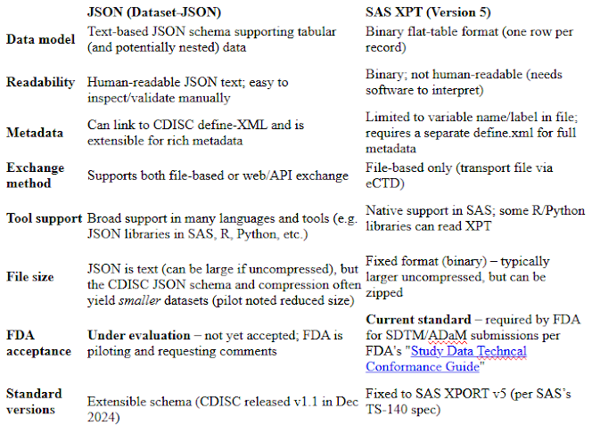
Regulatory study data (e.g. SDTM/SEND tabulations and ADaM analysis datasets) are currently exchanged in SAS XPORT (XPT) format, the legacy transport format used by the FDA. Each dataset is submitted as a separate .xpt file (for example, dm.xpt, adsl.xpt) with an accompanying define.xml to describe metadata​. See a previous blog article "Submit the Clinical Trial Datasets to FDA: Using the right .xpt file format" and FDA's "STUDY DATATECHNICAL CONFORMANCE GUIDE Technical Specifications Document".

In April 2025, FDA issued a Federal Register notice "Electronic Study Data Submission; Data Standards; Clinical Data Interchange Standards Consortium Dataset-JavaScript Object Notation;Request for Comments' stating it is exploring CDISC’s Dataset-JSON (v1.1) – a JSON-based schema – as a new exchange standard for study data, with the long-term potential to replace SAS XPT v5. The FDA is requesting public comment on adopting Dataset-JSON for future submissions. This report compares the JSON and XPT formats in the context of clinical data exchange and FDA submissions, covering their overviews, advantages/disadvantages, official regulatory stance, and practical sponsor considerations.

JSON Format (CDISC Dataset-JSON)

JSON (JavaScript Object Notation) is a text-based, human-readable data format widely used in web and health IT. For example, HL7’s FHIR standard commonly uses JSON for healthcare data exchange. CDISC’s Dataset-JSON (v1.1) is a JSON schema specifically designed to represent tabular clinical study data​. It is part of the CDISC Operational Data Model (ODM) v2.0 framework and is open-source and machine-readable. By design, each Dataset-JSON dataset can include column values in JSON and can reference a CDISC define.xml document for full metadata, linking data values to variable definitions​. This format supports both file-based and API-based exchange of data​. In practice, a set of JSON “dataset” files (one per domain) can be packaged with a define.xml or delivered via web services. The format is schema-driven and extensible, meaning it can accommodate richer metadata and longer field names than legacy formats. FDA notes that Dataset-JSON is simple to implement, very stable, and “widely supported” across software platforms​. Its use of JSON (Unicode text) makes it easy to parse with standard programming libraries (JavaScript, Python, R, etc.), and it aligns with modern data standards and the FDA’s Data Modernization goals​.

SAS XPORT (XPT) Format

The SAS XPORT (XPT) Transport Format v5 is the longstanding standard for FDA study data submission. XPT is a binary file format defined in the 1980s (SAS Technical Report TS-140) that encodes one dataset per file. In FDA submissions, each SDTM or ADaM dataset is delivered as an .xpt file (e.g. dm.xpt for demographics) along with a corresponding define.xml describing its variables​. FDA’s guidance and catalogs explicitly support XPT v5: for example, a technical guide lists DM.xpt and ADSL.xpt as required files​. The format is natively supported by SAS software (via PROC COPY or LIBNAME XPT) and by some third-party tools, ensuring that sponsors with SAS infrastructures can readily produce and consume it. However, XPT is not human-readable (it is binary) and has inherent limitations: variable names are limited to 8 characters (per the v5 spec) and labels to 40–200 characters, and there is no direct way to embed metadata (hence the separate define.xml). Because XPT v5 is a fixed, legacy format, it cannot represent nested or hierarchical data and requires separate metadata files. Despite these drawbacks, XPT is currently the required FDA exchange format for standardized study data – submissions that do not use FDA-approved formats (listed in the Data Standards Catalog) risk rejection​.


Advantages and Disadvantages

  • JSON advantages: JSON is a modern, widely-used exchange format. Dataset-JSON supports linking to define-XML and can include rich metadata within or alongside the data​. It is text-based and open, so it can be parsed by virtually any software (not just SAS), and it naturally integrates with web and API workflows​. FDA’s 2022 assessment found that JSON offers “smaller file sizes, additional metadata, and simpler processing” compared to legacy formats​. Because it is extensible, JSON removes XPT’s old limitations on field lengths and formats, enabling future evolution of data standards​. In the PhUSE pilot, sponsors noted potential for improved efficiency, hardware cost savings, and alignment with digital data ecosystems​.

  • JSON disadvantages: Dataset-JSON is not yet standard for FDA submissions, so adopting it today would require regulatory discussions or waivers. Industry tooling is nascent: sponsors must develop or acquire new processes (for example, SAS can export JSON but may need custom mapping to CDISC JSON schema). The FDA notice explicitly solicits comments on “integration challenges with existing tools and systems,” reflecting concern that current CDMS/SDTM pipelines are geared to XPT. Managing two formats during a transition also adds complexity. Because JSON is text, very large numeric datasets might be bulkier uncompressed (though gzip can mitigate this). Finally, until FDA grants formal acceptance (which would require a new guidance), sponsors using JSON would be taking a risk.

  • XPT advantages: XPT is a proven, FDA-sanctioned format. All major clinical data tools (especially SAS) can readily produce XPT. Regulatory reviewers and submission systems are already built for it, so sponsors face no surprise validation issues. Using XPT ensures immediate compliance with FDA standards (as affirmed in guidance and the Data Standards Catalog)​. The process of creating .xpt files is well-understood (e.g. using SAS PROC COPY or EXPORT), and many legacy datasets and analysis programs assume XPT input. XPT’s fixed format and single-table-per-file approach are simple and do not require on-the-fly schema negotiation. Long-term archiving of XPT files is routine (with define.xml), so sponsors have established practices for retainment.

  • XPT disadvantages: XPT is technologically outdated. Its fixed schema (8-char names, etc.) and binary nature limit flexibility​. It cannot easily accommodate new metadata or complex data types. Interoperability outside the SAS world is limited (one must use conversion tools). The format does not support streaming or API-based exchange, only static files. Because define.xml is separate, there is a risk of mismatches between data and metadata if not carefully managed. From an innovation standpoint, XPT is a single-version format (v5) with no path for evolving, so it is not aligned with modern data architectures (e.g. FHIR or big-data standards). Sponsors must also maintain SAS environments or rely on third-party readers, which may be a constraint for non-SAS shops.

  • It is noted that SAS has a procedure (Proc JSON) to facilitate the conversion of the SAS data sets to JSON format. It will not be an issue when data sets in JSON format are required for submission.

FDA Policy and Future Adoption (Federal Register Context)

According to the recent Federal Register notice, the FDA is not yet changing requirements but is actively evaluating JSON as an option. The notice explains that CDER and CBER have already conducted a pilot (with CDISC and PhUSE) showing that Dataset-JSON “has the potential to serve as a transport file for study data”​. Based on a 2022 assessment, the FDA found JSON to be the most promising modern format to potentially replace XPT v5​. FDA explicitly states it is considering Dataset-JSON “with the long-term potential to replace SAS XPORT Format (XPT)” for eStudy data​. The Agency is requesting comments on the benefits and risks of adopting JSON and on integration challenges with current tools​.

Importantly, the notice does not immediately authorize use of JSON in submissions. Until any regulatory change is finalized, sponsors must continue using FDA-supported formats (i.e. XPT v5 files with define.xml) for study data​. FDA will consider the public feedback before deciding. The notice indicates that if FDA does adopt Dataset-JSON, it will update its guiding documents (specifically the “Standardized Study Data” guidance implementing Section 745A(a)) to specify JSON as a permitted format​. In summary: FDA’s official preference today remains XPT (v5), but a future shift to JSON is on the table pending the rulemaking process and guidance revisions.

Practical Considerations for Sponsors

  • Regulatory compliance: Sponsors should follow FDA’s current standards. Until JSON is explicitly allowed, electronic study data must use formats in FDA’s Data Standards Catalog (currently XPT v5 for tabulation/analysis data)​. Any use of JSON for a submission would require prior FDA agreement (e.g. a pilot protocol or waiver). Sponsors should monitor the comment process (comments due June 9, 2025) and watch for any updated guidance.

  • Data preparation: Most sponsors build SDTM/ADaM in SAS or similar tools. Producing XPT files is straightforward in that environment (PROC COPY, EXPORT, or LIBNAME XPT). Moving to Dataset-JSON would require developing new export routines or converters. SAS 9.4 can write JSON, but additional CDISC JSON schema mapping may be needed. Conversely, new entrants or CDS/non-SAS shops may find JSON easier since many analytics platforms (R, Python, etc.) parse JSON naturally. Either way, sponsors may need to invest in tool upgrades or staff training if and when JSON becomes accepted.

  • Long-term archiving and interoperability: JSON’s plain-text nature may benefit long-term data access (no proprietary format, easily versioned). On the other hand, XPT has a long track record for archiving and reusability within regulated drug development. Sponsors should plan how to store meta-data (define.xml or embedded JSON schema) for whichever format they use.

  • Transition planning: FDA’s pilot (reported by CDER/CBER and industry) suggests promising results​. Sponsors may consider participating in further testing or industry surveys to shape the outcome. They should factor potential future regulatory changes into their IT roadmaps. For example, new statistical or data warehouse systems could be chosen with JSON capabilities in mind. Stakeholders (data managers, statisticians, IT) should communicate so that any shift in format will be smooth (e.g. ensuring traceability between old and new-format data).

  • Resource impact: In the near term, maintaining support for XPT remains essential (the FDA is not dropping it yet). In the long term, shifting to JSON may lower costs (e.g. fewer hardware needs, quicker data processing as noted in industry pilots​) but will require upfront effort. Sponsors should balance these factors and perhaps begin exploratory work (e.g. trial converting legacy XPT files to JSON) to assess any challenges ahead.

Trends and Upcoming Changes

The Federal Register notice signals a trend toward modernizing study data formats. JSON’s ubiquity in web and healthcare (e.g. FHIR) and its alignment with FDA’s Data Modernization Action Plan are strong drivers​. CDISC’s release of Dataset-JSON v1.1 (Dec 2024) and ongoing PhUSE work show industry momentum. If JSON is adopted, expect a multi-year transition: FDA will announce any implementation timeline in future Federal Register updates (similar to how new CDISC versions are phased in). Internationally, regulators (like Health Canada or PMDA) may also follow FDA’s lead. In practice, sponsors should prepare for eventual co-existence of formats: for some time, both XPT and JSON may be permitted (with effective dates).

In summary, the immediate trend is that the FDA is open to modern data standards: it found JSON superior to alternatives (SAS XPT v8 or XML) in 2022​. However, any concrete requirement change awaits the rulemaking process. Sponsors should stay informed, consider testing JSON internally, and be ready to meet whichever format the FDA ultimately endorses.

References: 

### This article is written with AI assistance ###. 

Monday, May 01, 2023

Violin plot versus Box-Whisker Plot

A box and whisker plot (Also called: box plot, box-whisker diagram) is defined as a graphical method of displaying variation in a set of data. In most cases, a histogram provides a sufficient display, but a box and whisker plot can provide additional detail while allowing multiple sets of data to be displayed in the same graph. The box-whisker plot displays the following in the data set. 

  1. Minimum value: The smallest value in the data set
  2. Second quartile: The value below which the lower 25% of the data are contained
  3. Median value: The middle number in a range of numbers
  4. Third quartile: The value above which the upper 25% of the data are contained
  5. Maximum value: The largest value in the data set

The box-whisker plot can also indicate the mean value (the dot). The difference between the mean value and the median value can indicate how skewed the data is. 


The box and whisker plot can also include the outliers where outliers are defined as values below Q1 - 1.5 * IQR or values above Q3 + 1.5 IQR (Q1 is 25th percentile and Q3 is 75th percentile, IQR - Interquartile is the distance between 25th percentile and 75th percentile). 


Boxplot can include the only box with lower, upper quartile and median, but not include the min and max values. In a paper by White et al "Combination Therapy with Oral Treprostinil for Pulmonary Arterial Hypertension A Double-Blind Placebo-controlled Clinical Trial", the boxplots without min and max were used to present the NT-proBNP data (a measure with skewed distribution). 

Recently, I see several papers using violin plots to display the data distribution. According to Wikipedia:

violin plot is a statistical graphic for comparing probability distribution. It is similar to a box plot, with the addition of a rotated kernel density plot on each side.

Violin plots are similar to box plots, except that they also show the probability density of the data at different values, usually smoothed by a kernel density estimator. Typically a violin plot will include all the data that is in a box plot: a marker for the median of the data; a box or marker indicating the interquartile range; and possibly all sample points, if the number of samples is not too high.

A violin plot is more informative than a plain box plot. While a box plot only shows summary statistics such as mean/median and interquartile ranges, the violin plot shows the full distribution of the data. The difference is particularly useful when the data distribution is multimodal (more than one peak). In this case a violin plot shows the presence of different peaks, their position and relative amplitude.

Like box plots, violin plots are used to represent comparison of a variable distribution (or sample distribution) across different "categories" (for example, temperature distribution compared between day and night, or distribution of car prices compared across different car makers).

A violin plot can have multiple layers. For instance, the outer shape represents all possible results. The next layer inside might represent the values that occur 95% of the time. The next layer (if it exists) inside might represent the values that occur 50% of the time.

Although more informative than box plots, they are less popular. Because of their unpopularity, they may be harder to understand for readers not familiar with them. In this case, a more accessible alternative is to plot a series of stacked histograms or kernel density distributions.


In a paper by Colli et al "Burden of Nonsynonymous Mutations amongTCGA Cancers and Candidate Immune CheckpointInhibitor Responses", the violin plot was used to display the distribution for r the number of NsM (log10) across different tumor types. 


SAS has a procedure Proc BOXPLOT to generate the box-whisker plots and SAS codes are also provided for generating the Violin plots. Other data analysis software including R have packages to generate the box-whisker plot and violin plot.  

Monday, April 11, 2022

Randomization and elements of randomization specifications

Randomization is the process of assigning trial subjects to treatment or control groups using an element of chance to determine the assignments to reduce bias. Randomization is the most critical feature of the RCT (randomized, controlled trials). In FDA's Good Review Practice: Clinical Review of Investigational New Drug Applications, the randomization is defined as the following: 
In the context of clinical trial design, randomization is defined as the allocation of patients to the investigational drug and control arms by chance. Randomization is intended to prevent any systematic difference between patients assigned to the treatments being compared and is a critical assumption for valid statistical comparisons. It is also intended to produce groups that are comparable (statistically balanced) with respect to both known and unknown factors. 
Randomization Schedule (also called a randomization scheme) is a list of randomization numbers and the corresponding treatment assignments in a data set (or in a printout in the early days). Randomization Schedule can be generated using SAS Proc Plan. A SUGI paper"Generating Randomization Schedules Using SAS Programming" I wrote 20 years ago is still applicable. 

Three steps for generating the randomization schedule for use in clinical trials: 

  • Create randomization specifications according to the study protocol requirements
  • Create and validate dummy randomization schedule for review and approval
  • Create and validate the final randomization schedule - the final randomization schedule for implementation

The dummy randomization schedule and the final randomization schedule have the same display but are generated with different random seeds (therefore different treatment assignments). The dummy randomization schedule can be reviewed by the study team and the final randomization schedule can only be distributed to the designated recipients who are unblinded to the treatment assignments. 

Here is an example randomization specification: 


Here are the elements for the randomization specifications: 

Study Design: clinical trial design dictates how the subjects are assigned to receive different study treatments. In clinical trials with parallel design, subjects are randomized to receive the treatments; in clinical trials with cross-over design, subjects are randomized to different treatment sequences. 

The study design will also include a randomization strategy: 

Fixed randomization: 
  • fixed-randomization scheme (rarely used)
  • block randomization
  • stratified randomization, 
Dynamic randomization: 
       Adaptive randomization. 

See FDA's Good Review Practice: Clinical Review of Investigational New Drug Applications for definitions of these different types of randomizations. 

Blind and blindness: concealing treatment assignments and treatment allocations. 

Block: Block randomization works by randomizing subjects within blocks such that within each block, the # of subjects is balanced between treatment groups or according to the randomization ratio. 

Block Size: The size of each block. Block sizes must be multiples of the number of treatments and take the allocation ratio into account. For 1:1 randomization of 2 groups, blocks can be sizes 2, 4, 6 etc. For 1:1:1 randomization of 3 groups or 2:1 randomization of 2 groups, blocks can be sizes 3, 6, 9 etc. 

If the randomization is by site, to prevent the potential unblinding/guessing, the block size can be set up as variable for different blocks or is not revealed to the investigators and study team. With central randomization, potential unblinding is less of a concern and the block size can be the smallest multiples (for 1:1 randomization of 2 groups, the block size can be 2). 

Number of Blocks

Total Number of Randomizations: Total number of randomization numbers to be generated. Total number of randomizations = Number of blocks x Block size. Usually, randomization numbers more than the protocol-specified sample size are generated to make sure that there is a sufficient number of randomizations in the situation that the sample size may be increased or randomization errors that results in some randomization numbers not being used. If the study protocol specifies 300 subjects to be randomized, it may be good to generate 600 randomizations. 

Strata and Stratification Factors: Stratification factors are those known factors that may have an impact on treatment responses. Stratification factors are the known confounders. The most common stratification factor is the baseline disease severity which usually has an impact on the treatment responses. When stratification factors are specified, stratified randomization is employed to prevent imbalance between treatment groups for known factors that influence prognosis or treatment responsiveness. The randomization schedule is essentially generated for each stratum. 

See previous posts "Restricted randomization, stratified randomization, and forced randomization"; "Minimization Algorithm to Achieve Treatment Balance across Strata in Stratified Randomization", and "Handling Randomization Errors in Clinical Trials with Stratified Randomization"

Randomization Ratio (or allocation ratio): The ratio for treatment groups. The typical randomization ratio is balanced: 1:1 ratio for two treatment groups (if the block size is 2, for every 2 subjects randomized, there will be one assigned to group A and one assigned to group B); 1;1:1 ratio for three treatment groups, ... The randomization ratio can also be unbalanced such as 2:1 (if the block size is 3 (minimal), for every three subjects randomized, there will be two assigned to group A and one assigned to group B) and 3:1,...  FDA's Good Review Practice: Clinical Review of Investigational New Drug Applications described the randomization ratio (allocation ratio) as the following: 

Allocation of patients to treatment and control arms can be uniform or nonuniform. Uniform allocation (i.e., equal numbers allocated to each arm) is the usual practice and provides the most statistical power for a given total sample size. Nonuniform allocation  may lower costs (if one arm is substantially more expensive) and improve recruitment (if one arm is generally preferred) and may increase the size of the exposed patient safety database. In general, the loss of statistical power in seeking to detect a difference between treatments going from uniform allocation to 2:1, or even 3:1, is fairly small; however, as more imbalanced allocation occurs, power drops off more rapidly. A special case is where a trial seeks both to show effectiveness versus placebo and to compare the test drug with an active control. In that case, it usually is necessary for the active treatment groups to be substantially larger to examine the smaller differences between the active treatments. 

Randomization Number: a series of sequential numbers corresponding to treatment assignments. 'randomization number' is not random, the associated treatment assignments are random. 

Randomization can be recorded in the database and serve as the subject identifier (same as the subject number). Seeing the randomization number will not unblind the subject's treatment assignment.  

Treatment Code: short description or abbreviation for long treatment descriptions. Treatment code can be just the letters (such as A = Active; P = Placebo). 

Treatment Description: the detailed description of the treatment groups. It can be just 'Active', 'Placebo' or more descriptive as "Inhaled drug X BID', 'Inhaled Placebo BID'.

Dummy Randomization Schedule: also called surrogate randomization schedule - the randomization schedule for review and approval purposes. The dummy randomization schedule should have exactly the same features as the final randomization schedule except that a different random seed is used (therefore, the treatment assignments are different). 

Random Seed: A number (integer) used to initiate a pseudorandom number generator. Random Seed is a number used in SAS Proc Plan to generate the randomization schedule. Random Seed needs to be specified in the program in order to reproduce the same randomization schedule. 

After dummy randomization schedule is reviewed and approved, a final randomization schedule can be generated for implementation by changing the random seed. 

Randomization Envelopes: Envelopes that contain the treatment assignment information. The outside of the envelope contains the randomization number, and the inside of the envelope contains the randomization number and the corresponding treatment assignments and treatment descriptions. Randomization envelopes were used in the randomization process in the early days. The randomization process using randomization envelopes is now replaced with the Interactive Response Technology (IRT) including the Interactive Web Response System (IWRS) or Interactive Voice Response System (IVRS). 

Central Randomization is the opposite of randomization by the site. When a subject is eligible to be randomized, the site will contact a centralized contact (usually the computer system, IRT) to obtain the next available randomization number in the corresponding stratum regardless of the individual sites.

Monday, January 17, 2022

Paired T-test and McNemar's test for paired data based on the summary data

Sometimes, it is necessary for us to calculate the p-values based on the summary (aggregate) data without the individual subject level data. In a previous post, group t-test or Chi-square test based on the summary data was discussed. Group t-test and chi-square test can be used in the setting of parallel-group comparisons. 

In single-arm clinical trials, there is no concurrent control group, and the statistical test is usually based on the pre-post comparison. For continuous measures, the pre-post comparison can be tested using paired t-test based on the change from baseline values (i.e., post-baseline measures - baseline measures):  For discrete outcomes, the pre-post comparison may be tested using McNemar's test.

Paired t-test:

A paired t-test is used when we are interested in the difference between two variables for the same subject. Suppose we have the descriptive statistics for change from baseline values: 83 subjects had the outcome measures at both baseline and week 12 (therefore, 83 pairs), the mean and standard deviation for these 83 pairs are: 10.7 (70.7); 68 subjects had the outcome measures at both baseline and week 24 (therefore 68 pairs), the mean and standard deviation for these 68 pairs are 20.2 (80.9). 

With the mean difference, the standard deviation for differences, and the sample size (# of pairs), we have all the elements to calculate the t statistics and therefore the p-value using the formula below. 

This can be implemented in SAS as the following - t-statistics and p-values can be calculated for each of weeks 12 and 24 based on the aggregate data. 
 

McNemar's Test:

McNemar's test is a statistical test used on paired nominal data. It is applied to 2 × 2 contingency tables with a dichotomous trait, with matched pairs of subjects, to determine whether the row and column marginal frequencies are equal (that is, whether there is "marginal homogeneity"). In clinical trials, the aggregate data may not be obvious as a 2 × 2 contingency table but can be converted into a 2 × 2 contingency table. 

Suppose we have the following summary data for post-baseline week 12: the number and percentage of subjects with improvement, stable (no change), and deterioration categories. 


All subjects

(n=300)

Week 12

Improved

  54 (18%)

No Change

228 (76%)

Deteriorated

  18 (  6%)

At Week 12, there are more subjects in the 'Improved' category than in the 'Deteriorated' category even though the majority of subjects are in the 'No Change' category. Are they more subjects with improvement than deterioration? 

Assuming that change from category 1 to 0 is 'Improved' and change from category 0 to 1 is 'Deteriorated', the table above can be converted into a 2 × 2 table: 


Baseline

0

1

Week 12

0

228

54

1

18

0

or


Baseline

0

1

Week 12

0

0

54

1

18

228

For McNemar’s test, only the numbers in the diagonal discordant cells (in our case, the # of improved and the # of deteriorated) are relevant.

The concordant cells (in our case, the # of no change) will only contribute to the sample size (therefore the degree of freedom), not have an impact on the p-value. How the # of subjects with the ‘No Change’ is split doesn’t matter with our calculation of chi-square statistics and therefore the p-value.

For the data highlighted in yellow, McNemar’s test can be performed using the SAS codes like this (weight statement indicates count variable is the frequency of the observation and agree option requests McNemar's test). How the 228 subjects in the concordance ‘No Change’ category are split has no impact on the p-value calculation. 


Friday, November 26, 2021

Venn Diagram to Display the Distribution of the Adverse Events

Visualizing the clinical trial data is becoming more common and various plots can be drawn to visualize the data. In previous posts, we discussed various types of plots that can be used in describing the clinical trial data. 

Recently, we are discussing the use of the 'Venn diagram' for displaying the distribution of the adverse events - the number and percentage of overlapping AEs. See an example of a four-way Venn diagram below:


Wikipedia introduced the Venn diagram as the following: 
A Venn diagram is a widely-used diagram style that shows the logical relation between sets, popularized by John Venn in the 1880s. The diagrams are used to teach elementary set theory, and to illustrate simple set relationships in probability, logic, statistics, linguistics and computer science. A Venn diagram uses simple closed curves drawn on a plane to represent sets. Very often, these curves are circles or ellipses.
According to the paper "V is for Venn Diagrams!": 
Venn diagrams where introduced in 1883 by John Venn (1834-1923), the Hull born philosopher and mathematician. They are a great way to visualize elements that are unique to only one group and simultaneously visualize elements that intersect with other groups. They are symmetrical by nature and the number of groups in a Venn diagram = 2n (including the group outside the diagram).

In clinical trials or the pharmacovigilance field, Venn Diagram can be used to virtualize the distribution of the adverse events, especially to display the distribution and relationships of the frequent adverse events. 

In NIH's "Guidance on Reviewing and Reporting Unanticipated ProblemsInvolving Risks to Subjects or Others and Adverse Events", the Venn diagram was mentioned for summarizing the general relationship between adverse events and unanticipated problems. 


In a paper by Gattepaille et al"Prospective Evaluation of Adverse Event Recognition Systems in Twitter: Results from the Web‑RADR Project", the Venn diagram was used to summarize the relationship of the recall performance results of the first two components, the relevance filter, and the NER module. 


In a paper by Xie et al "Differential Adverse Event Profiles Associated with BCG as a Preventive Tuberculosis Vaccine or Therapeutic Bladder Cancer Vaccine Identified by Comparative Ontology-Based VAERS and Literature Meta-Analysis", Venn diagram was used to compare four groups of the AEs associated with BCG TB vaccine or bladder cancer vaccine using VAERS and literature resources.

Monday, April 19, 2021

Restricted Mean Survival Time (RMST) for Handling the Non-Proportional Hazards Time to Event Data

Time to event analysis (or traditionally survival analysis) is one of the most common analyses in clinical trials. In general, the time to event analysis relies on the assumption of the proportional hazards. However, quietly frequently, we may find that the proportional hazards assumption is violated, especially in many immuno-oncology trials. When the proportional hazards assumption is violated, alternative approaches may be needed to analyze the data to achieve statistical power. As discussed in the previous post "Non-proportional Hazards: how to analyze the time-to-event data?", one of the alternative approaches is the restricted mean survival time (RMST) method. 

RMST is one of the Kaplan-Meier-based methods and is essentially calculating and comparing AUCs under Kaplan-Meier Curves for different treatment groups or different comparative groups. It has been said that RMST analysis has the following advantages:
  • Model-free, robust, and easily interpretable treatment effect information
  • Produces radically powerful patterns of difference as has been observed in some recent Oncology clinical trials
  • Accepted approach by regulatory agencies and industry leaders
RMST has been mentioned in the latest FDA guidance for Industry (2020): Acute Myeloid Leukemia: Developing Drugs and Biological Products for Treatment as an alternative approach to analyzing the data when the non-proportionality hazards occur (e.g., plateauing effect). 

"Plateauing Effect

Trials designed to cure AML often result in survival contours characterized by an initial drop followed by a plateauing effect after some time point post randomization. This is an example of nonproportional hazards. While the log-rank test is somewhat robust to nonproportionality, it generally results in loss of power. Furthermore, nonproportionality can cause difficulty in describing the treatment effect. FDA is open to discussion about analyses based on other approaches, such as weighted Cox regression or other weighted methods, or summarizing the treatment effect using restricted mean survival time (RMST) or landmark survival analysis. Plans that use these alternative approaches should include:
    • justification for what constitutes clinically meaningful difference,
    • justification of design parameters, such as sample size and follow-up duration, based on this endpoint, and
    • justification for the value of the threshold that will be used to calculate the RMST.
RMST analysis has also been used as a primary analysis approach or for sensitivity analysis in FDA reviews: 

In NDA of Baloxavir marboxil in treatment of acute, uncomplicated influenza, both applicants and the FDA reviewer analyzed the data using RMST. It stated:
Restricted mean survival time (RMST) up to Day 10 was estimated for each treatment group along with the difference between RMST in the two treatment groups. RMST is a measurement of the average survival from time 0 to a specified time point (e.g., 10 days) which is equivalent to the area under the Kaplan-Meier curve from the beginning of the study through that time point.

At an FDA CDRH Medical Devices Advisory Committee Circulatory System Panel meeting in 2019, the independent statistical consultant addressed the analysis issue when the proportional hazards assumption is violated:

The proposal they made was the restricted mean survival time. The restricted mean survival time is area under curve. Please note the word restricted. Mean survival time is over a period of time, according to the rules that have been laid out, so that you're not looking, like with proportional hazards, over all the follow-up that could have possibly happened or in binary where you're only looking at the patients that survive. The restricted mean would say we're going to look between, let's say, 0 and 5 years because we have sufficient information to make that kind of assessment.

The paper showed that the restricted mean has just as much power as proportional hazards when the assumptions are there for proportional hazards, and then has more power when the assumptions are violated.

There's also some advantages in terms for clinicians, in terms of explaining this to the patient. It's hard to talk about hazards or number needed to treat. But if you could say to a patient over a 60-month period the average survival time is 55 months with Device A versus 52 months with Device B, now they can look at what their life is going to look like in the next 60 months and make a decision.

Unfortunately, it was not me who noticed this. This was actually from a presentation by FDA. Several very smart statisticians had talked about the restricted mean and have made recommendations on using it for both proportional violations and for its interpretation.

In FDA Briefing Document for Oncologic Drugs Advisory Committee Meeting (December 17, 2019) to review Olaparib for the maintenance treatment of adult patients with deleterious or suspected deleterious germline BRCA mutated (gBRCAm) metastatic adenocarcinoma of the pancreas

FDA performed a test to evaluate whether the proportional hazard assumption was met. This test failed to detect evidence of non-proportionality; however, such a test may lack power to detect non-proportionality due to the small sample size. The Kaplan-Meier curves of PFS appear to show some degree of nonproportionality. The curves did not show separation until approximately 4 months, after approximately 53% of patients either had events or were censored. FDA performed additional sensitivity analyses by applying the restricted mean survival time (RMST) method using different truncation points (15 months and 18 months). The truncated time was selected (15 or 18 months) such that approximately 8-12% patients remained at risk. Based on the truncation times, the estimated RMST difference in PFS between arms ranged from 2.6 months (95% CI: 0.9, 4.3) to 3.1 months (95% CI: 1.0, 5.2). The range of the RMST differences again demonstrated great variation in the difference in PFS and the lower ends did not suggest that there was a clinically meaningful difference.

Thanks to the software, RMST analyses can be easily implemented in SAS or R. In the latest version (version 15.1 or above) of SAS/Stat, RMST is included in SAS Proc LIFETEST with RMST option and Proc RMSTREG. See a nice paper by 
With R, the package for RMST analysis is survRM2 that is developed by Hajime Uno from Dana-Farber Cancer Institute

For RMST analysis, it is important to select the cut-off value (tau) for the truncated time. The different selection of taus will give different results. The selection of tau can sometimes be arbitrary. In an FDA briefing document above, the FDA statistician chose the truncated time such that approximately 8-12% of patients remained at risk.

There are different ways to calculate the RMST:

  • Non-parametric method
  • Regression Analysis Method
  • Pseudo-value Regression Method
  • IPCW Regression - Inverse Probability of Censoring Weighting (IPCW) regression
  • Conditional restricted mean survival time (CRMST)

According to the paper by Guo and Liang (2019) "Analyzing Restricted Mean Survival Time Using SAS/STAT®", non-parametric analysis can be implemented using Proc Lifetest; regression analysis, pseudo-value regression, and IPCW regression can be implemented using SAS Proc RMSTREG. 

FDA statisticians also proposed an approach 'conditional restricted mean survival time' or CRMST. This approach was described in the paper by Qiu et al (2019) "Estimation on conditional restricted mean survival time with counting process" and also in a presentation by Lawrence and Qiu (2020) Novel Survival Analysis When Hazards Are Nonproportional and/or There Are Multiple Types of Events. CRMST can allow the AUC under K-M curves to be calculated from an interval time (not necessarily to be started from the 0 time). They claim CRMST is better for event-driven studies where the time to the first event is the interest. They concluded the following: 
CRMST possesses all the desirable statistical properties of RMST. In particular, it does not rely on proportional hazard assumption. In addition, CRMST measures an average event-free time in the time range at issue and has straightforward interpretation. In case that two survival curves cross, CRMST can be estimated separately before and after crossing and the CRMST differences can be used to assess benefit versus harm.

Further Reading:

Friday, October 23, 2020

Randomly Select a Subset from a Population Using SAS Proc Surveyselect and Dividing a Population into Multiple Subsets Using SAS Proc Rank

During a clinical trial, sometimes, we are asked to select a subset of subjects from all trial participants. For example, for a clinical trial with 500 subjects enrolled, we need to select randomly 10% of subjects to do quality control (i.e., select 50 subjects from total of 500 enrolled subjects.

This can be easily accomplished by using SAS Proc Surveyselect. The full SAS manual about Proc SurveySelect can be found here.

Proc surveyselect data=AllEnrolled method=srs n=50 out=random50;
Run;
Proc print data=random50 noobs;
Var SubjectID;
run;

During the statistical analyses especially the posthoc analyses, we may be asked to perform subgroup analyses by median (2 groups), tertiles (3 groups), quartiles (4 groups). For example, we may want to do a subgroup analysis of treatment comparison by baseline BMI where subjects are split into three groups (tertiles) with an equal number of subjects in each subset. This can be easily implemented by using SAS Proc Rank.

Proc Rank data=allEnrolled group = 3 out=test;
var BMI;
ranks rank_BMI;
run;
proc print data=test;
run;

The full SAS manual about Proc Rank can be found here. Two papers from SAS blogs discussed this related issue. 

Sunday, August 30, 2009

SAS IQ and OQ

I am not sure how many people really know these abbreviations: DOE, IQ, OQ, PQ, PV. These are the terms used in the validation of a software or computerized systems.

DOE = Design of Experiment
IQ = Installation Qualification
OQ = Operational Qualification
PQ = Performance Qualification
PV = Process Validation

For off-the-shelf software, I have never really thought about the validation or qualification issue. I always think that the software like SAS (we use it almost daily) is just like the Miscrosoft Office. Once you install on your PC, you are ready to use.

I really learned that if the software is used for regulatory submission, certain level of validation (precisely qualification) need to be performed. There is no exception for SAS.

For SAS software, the IQ and OQ need to be performed. The instructions for the SASInstallation Qualification (IQ) and Operational Qualification (OQ) tools can be found at SAS website and at http://support.sas.com/kb/17/046.html. This was also mentioned in SAS quality document. SAS actually has a SOP for IQ and OC.

By digging in this issue further, the verification and validation of a software or computerized system is not a trivial task. Wikipedia has a topic discussing about verification and validation. The recent issue of DIA Global forum has an article by Chamberlain and they discussed qualification (vs validation) of the infrastructure.

However, I think that the validation for off-the-shelf software should be much simpler than a self-developed computerized system (such as an internal EDC system). FDA has a pertinent guidance about the computerized systems: Computerized systems used in clinical investigations and its old version titled "Computerized systems used in clinical trials".

CDRH also had a guidance titled "General Principles of Software Validation; Final Guidance for
Industry and FDA Staff
". This guidance indicated that the software used in medical device need to go through a full-scale validation process.

Sunday, April 05, 2009

Least squares means (marginal means) vs. means


If you work with SAS, you probably heard and used the term 'least squares means' very often. Least squares means (LS Means) are actually a sort of SAS jargon. Least square means is actually referred to as marginal means (or sometimes EMM - estimated marginal means). In an analysis of covariance model, they are the group means after having controlled for a covariate (i.e. holding it constant at some typical value of the
covariate, such as its mean value).

I often find that it is neccessary to use a very simple example to illulatrate the difference between LS Means and Means to my non-statistician colleagues. I made up the data in Table 1 above. There are two treatment groups (treatment A and treatment B) that are measured at two centers (Center 1 and Center 2).

The mean value for Treatment A is simply the summation of all measures divided by the total number of observations (Mean for treatment A = 24/5 = 4.8); similarly the Mean for treatment B = 26/5 = 5.2. Mean for treatmeng A > Mean for treatment B.

Table 2 shows the calculation of least squares means. First step is to calculate the means for each cell of treatment and center combination. The mean 9/3=3 for treatment A and center 1 combination; 7.5 for treatment A and center 2 combination; 5.5 for treatment B and center 1 combination; and 5 for treatment B and center 2 combination.

After the mean for each cell is calculated, the least squares means are simply the average of these means. For treatment A, the LS mean is (3+7.5)/2 = 5.25; for treatment B, it is (5.5+5)/2=5.25. The LS Mean for both treatment groups are identical.

It is easy to show the simple calculation of means and LS means in the above table with two factors. In clinical trials, the statistical model often needs to be adjusted for multiple factors including both categorical (treatment, center, gender) and continuous covariates (baseline measures). The calculation of LS mean is not easy to demonstrate. However, the LS mean should be used when the inferential comparison needs to be made. Typically, the means and LS means should point to the same direction (while with different values) for treatment comparison. Occasionally, they could point to the different directions (treatment A better than treatment B according to mean values; treatment B better than treatment A according to LS Mean).

SAS procedure GLM has a nice discussion about the comparison of Least Square Means vs. Means. A small article "Means vs LS Means and Type I vs Type III Sum of Squares"by Dan may also help.