Data visualization is one
critical part in statistical analysis. Data visualization is through various
plots. Here are some of the plots commonly used in presentation of clinical trial data. These graphs may be generated using commercially software, but they can always be programmed using SAS procedures:
Kaplan-Meier
plot is used in analysis of time-to-event variables and can be easily
generated using SAS
Proc Lifetest.
Q-Q plot is used to
compare the data set to a theoretical model (for example, comparing to a normal
distribution) and normal Q-Q plot can be easily generated using Proc
Univariate.
Box plot or box-and-whisker plot is used to show quartiles and display the variation in samples
of a statistical population. The boxplot showes distributions of data is particularly
useful for understanding the shape of the distribution and whether there are
outliers. SAS
has a specific procedure for box-plot – Proc
Boxplot.
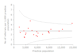
Funnel
plot is a graph designed to check for the
existence of publication bias;
funnel plots are commonly used in systematic
reviews and meta-analyses.
In the absence of publication bias, it assumes that the largest studies will be
plotted near the average, and smaller studies will be spread evenly on both
sides of the average, creating a roughly funnel-shaped
distribution. Deviation from this shape can indicate publication bias.
Funnel plot can be generated using Excel. Rick Wicklin's SAS blog 'The Do Loop' has discussions about generating funnel plot using SAS.
Swimmer plot is a good tool to look at an individual subject’s pattern of response. A swimmer plot is a graphical way of showing multiple pieces of a subject’s response 'story' in one glance. Swimmer plot includes a bar showing the length of treatment duration for each patient, classified by the disease stage at baseline, one for each patient in the study. Graph also includes indicators for the start and end of each response episode, classified by complete or partial response, and an indicator showing whether the patient is a "Durable responder".
Swimmer plot is a good tool to look at an individual subject’s pattern of response. A swimmer plot is a graphical way of showing multiple pieces of a subject’s response 'story' in one glance. Swimmer plot includes a bar showing the length of treatment duration for each patient, classified by the disease stage at baseline, one for each patient in the study. Graph also includes indicators for the start and end of each response episode, classified by complete or partial response, and an indicator showing whether the patient is a "Durable responder".
- Sanjay Matange’s blot ‘Graphically Speaking’ had an article discussing how to program the swimmer plot.
- Swimmer Plot: Tell a Graphical Story of Your Time to Response Data Using PROC SGPLOT
Forest
Plot is a graphical display designed to
illustrate the relative strength of treatment effects in multiple quantitative
scientific studies addressing the same question. It was developed for use in
medical research as a means of graphically representing a metal-analysis of the results of randomized controlled clinical trials.
Forest plot is also frequently use for graphically
displaying the results from subgroup analyses. For example, in a paper “Progression
parameters for emphysema: A clinical investigation”, the forest plot was
used to show the overall effect and the effect by site.
The commercial software Comprehensive Meta Analysis can easily
generate the forest plot as part of the Meta Analysis. Forest Plot can also be generated
using SAS Proc SGPLOT.
There are many papers discussing the programming and the interpretation for the
Forest Plot.
- Forest Plot with SAS for subgroup analysis
- Forest Plot of Hazard Ratios by Patient Subgroup
- SAS codes for creating the forest plot for sub-group analyses
I had a previous article discussing Spaghetti plot. Spaghetti
plot is mainly used in longitudinal data analysis to see the individual profiles
in one plot and in pharmacokinetic analysis to see the time-concentration
profiles for all individual subjects in one plot.
Spaghetti plot can be generated using SAS PROC SGPLOT:
proc sgplot data=cs NOAUTOLEGEND ;There are other discussions about generating the Spaghetti plot.
series x = timepoint y = concentration
/group=subject lineattrs = (thickness = 1 pattern=solid color=black) markers;
xaxis label = 'x axis label' values=(0, 4, 8, 24, 48, 120, 168);
yaxis label = 'y axis label' grid values = (0 to 70 by 10);
run;
- Create a spaghetti plot with the SGPLOT procedure
- How can I make spaghetti plots?
- Creating Customized Spaghetti Plots
- Longitudinal data: plots of individual profiles and mean
Bubble plot is
a type of plot that displays
three dimensions of data. Each entity with its triplet (v1, v2, v3) of associated data is plotted as a disk that expresses two of
the vi values through the disk's xy location and the third through its
size. Bubble charts can be considered a variation of the scatter plot, in which
the data points are replaced with bubbles.
Bubble plot is easily to be generated using Microsoft Excel (see a
youtube video), but it can also be generated using SAS.
Reference:


No comments:
Post a Comment